Como fazer um Dashboard em Python – Utilizando Dash
14 minutos para ler

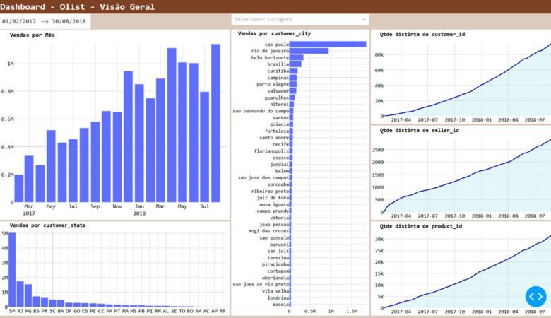
O projeto é construir este resultado
Introdução
Python é uma linguagem com inúmeros recursos. Dentre eles o Dash, uma biblioteca incrível que nos permite com relativa facilidade elaborar excelentes dashboards.
Vamos fazer um pequeno projeto para entendermos como funciona a biblioteca Dash.
O funcionamento básico da biblioteca é o seguinte:
Cria-se um layout. Como se estivesse criando um esqueleto de um website. Depois cria-se funções que recebem valores dos filtros, geram gráficos com esses filtros, e a saída da função (o gráfico) vai para o lugar desejado do layout.
É possível, inclusive, criar um efeito semelhante ao do Power BI – quando uma barra de um gráfico é clicada outros gráficos são filtrados.
Sim, a ideia é bem simples. Só demanda umas tantas calorias.
Base de Dados
A base que escolhemos para nosso projeto foi a “Brazilian E-Commerce Public Dataset by Olist” encontrada no site da Kaggle pelo link: Brazilian E-Commerce Public Dataset by Olist (kaggle.com). Nela temos 100 mil ordens de venda com a relação de produtos, valores, frete, data de emissão e de entrega, entre outras informações.
• olist_customers_dataset.csv
∘ customer_id
∘ customer_unique_id
∘ customer_zip_code_prefix
• olist_order_items_dataset.csv
∘ order_id
∘ order_item_id
∘ product_id
• olist_orders_dataset.csv
∘ order_id
∘ customer_id
∘ order_status
∘ order_purchase_timestamp
• olist_products_dataset.csv
∘ product_id
∘ product_category_name
∘ product_name_lenght
Bibliotecas utilizadas
Pandas e Numpy para carregamento e tratamento dos dados:
Plotly para gerar os gráficos.
Dash para gerar o dashboard.
import pandas as pd
import numpy as np
from dash import Dash, dcc, html, Input, Output, State, dash_table, callback
import dash_bootstrap_components as dbc
from plotly import graph_objects as go
import plotly.subplots as sp
Carregamento dos dados
A tabela base dos gráficos será a “olist_order_items_dataset” (no código chamaremos de ‘f_order_items’), porém ela não contém todas as colunas necessárias.
Vamos buscar o restante das colunas nas outras tabelas do dataset.
A tabela de itens vendidos é a olist_order_items:
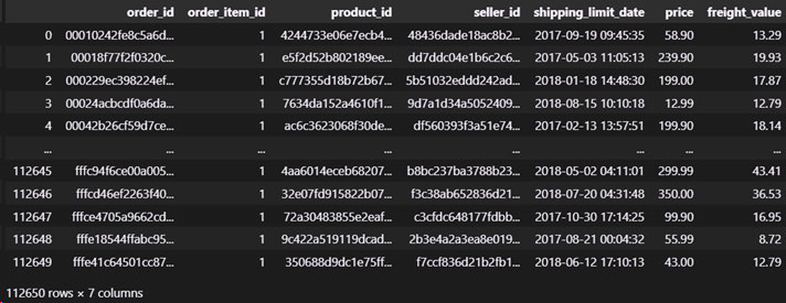
Depois de adicionar a data de entrega, cidade e estado do cliente e categoria do produto as colunas ficaram assim:
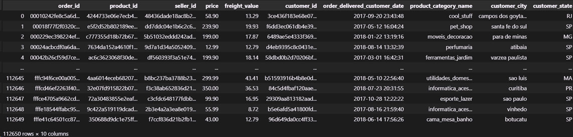
Como os dados estão mais consistentes no período entre 01/02/2017 e 31/08/2018 vamos deixar os dados filtrados desde o início.
O código de toda esta etapa é o seguinte:
app = Dash(__name__, external_stylesheets=[dbc.themes.BOOTSTRAP])

local_dados = "C:/Users/danil/OneDrive/Danilo_Back-up/Kaggle/Brasilian_Ecommerce_Olist/"

d_product     = pd.read_csv(f'{local_dados}products.csv',   sep=",", decimal=".")
d_customer    = pd.read_csv(f'{local_dados}customers.csv',  sep=",", decimal=".")
f_orders      = pd.read_csv(f'{local_dados}orders.csv',     sep=",", decimal=".")
f_order_items = pd.read_csv(f'{local_dados}order_items.csv',sep=",", decimal=".")

f_order_items = f_order_items.merge(
    f_orders[['order_id', 'customer_id', 'order_delivered_customer_date']],
    how = 'left',
    on = 'order_id'
).merge(
    d_product[['product_id', 'product_category_name']],
    how = 'left',
    on = 'product_id'
).merge(
    d_customer[['customer_id', 'customer_city', 'customer_state']],
    how = 'left',
    on = 'customer_id'
).drop(columns = ['order_item_id','shipping_limit_date'])

f_order_items = f_order_items.assign(
    order_id                      = f_order_items['order_id'].astype('category'),
    product_id                    = f_order_items['product_id'].astype('category'),
    seller_id                     = f_order_items['seller_id'].astype('category'),
    customer_id                   = f_order_items['customer_id'].astype('category'),
    order_delivered_customer_date = f_order_items['order_delivered_customer_date'].astype('datetime64[ns]'),
    product_category_name         = f_order_items['product_category_name'].astype('category'),
    customer_city                 = f_order_items['customer_city'].astype('category'),
    customer_state                = f_order_items['customer_state'].astype('category'),
)

f_order_items = f_order_items.loc[
    (f_order_items['order_delivered_customer_date'] >= pd.to_datetime('2017-02-01')) &
    (f_order_items['order_delivered_customer_date'] <= pd.to_datetime('2018-08-31'))
]
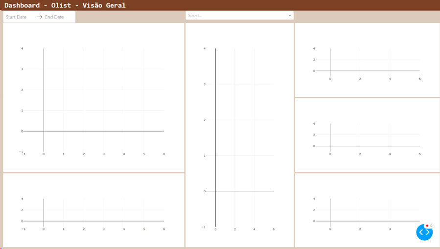
Definições gerais de Layout
Abaixo estão uma série de definições para a fonte e formatação dos textos, margens e cores de fundo.
header_font_size   = 28
header_font_family = 'consolas'
header_color       = '#6F432A'

row_sep_height = 5
gap = 'g-1'

body_height      = 888   # divisível por 3
body_font        = 17
body_color       = '#D6CABA'
body_font_family = 'consolas'
body_margin_left = 4
body_margin_right= 4
Layout
Vamos dividir nosso layout em 3 linhas e 3 colunas.
A primeira linha terá o título do dashboard.
A segunda terá os filtros de data e categoria de produto.
A terceira terá os gráficos.
A linha dos gráficos será dividida em 3 colunas: a primeira com as vendas por mês e as vendas por estado, a segunda com as vendas por cidade, e a terceira com a contagem acumulada de clientes, vendedores e produtos.
O código para o layout ficou assim:
app.layout = dbc.Container([

        # ======================= Header – 1ª linha ==============================
        dbc.Row([
            dbc.Col([
                html.Div(
                    "Dashboard - Olist - Visão Geral",
                    id="texto_header",
                    style={
                        'font-size':header_font_size, 'color':'white', 'font-weight':'bold', 'font-family':header_font_family
                    }
                ),
            ], width={"size": 12, "order": 1, "offset": 0}, md=0, lg=0)
        ], style={'marginLeft': 0, 'marginRight': 0, 'background':header_color}),

        # ========================= Filtros – 2ª linha ============================
        dbc.Row([

            dbc.Col([
                dcc.DatePickerRange(
                    id = 'date_range'
                ),
            ], width=5),

            dbc.Col([
                dcc.Dropdown(
                    id = 'category_dropdown',
                ),
            ], width=3),

        ], style={'marginLeft': body_margin_left, 'marginRight': body_margin_right, 'height':53}, className=gap),

        # =========================== Body – 3ª linha ==============================
        dbc.Row([

            # ================ Coluna 1 ========================
            dbc.Col([
                dbc.Row([
                    dcc.Graph(
                        id = "graph_vendas_geral", clear_on_unhover=True
                    )
                ], style={'height':body_height/3 *2 -row_sep_height}),

                dbc.Row([], style={'height':row_sep_height }),
                dbc.Row([
                    dcc.Graph(
                        id = "graph_vendas_state", clear_on_unhover=True
                    )
                ], style={'height':body_height/3 -row_sep_height}),
            ], width=5),

            # ================ Coluna 2 ========================
            dbc.Col([
                dbc.Row([
                    dcc.Graph(
                        id = "graph_vendas_city", clear_on_unhover=True
                    )
                ], style={'height':body_height -row_sep_height}),
            ], width=3),

            # ================ Coluna 3 ========================
            dbc.Col([
                dbc.Row([
                    dcc.Graph(
                        id = "graph_qtd_customer"
                    )
                ], style={'height':body_height/3 -row_sep_height}),

                dbc.Row([], style={'height':row_sep_height }),

                dbc.Row([
                    dcc.Graph(
                        id = "graph_qtd_seller"
                    )
                ], style={'height':body_height/3 -row_sep_height}),

                dbc.Row([], style={'height':row_sep_height }),

                dbc.Row([
                    dcc.Graph(
                        id = "graph_qtd_category"
                    )
                ], style={'height':body_height/3 -row_sep_height}),

            ], width=4),

        ], style={'marginLeft': body_margin_left, 'marginRight': body_margin_right, 'height':body_height +10}, className=gap),

], style={'marginLeft': 0, 'marginRight': 0, 'background-color':body_color, 'overflowX': 'hidden', 'padding': 0}, fluid=True)


if __name__ == "__main__":
    app.run_server(port=8050, debug=True)
O resultado do Código é o seguinte:
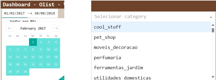
Linha 2 – Filtros de Data e Categoria
Na linha 2 colocaremos dois objetos. O primeiro irá receber duas datas do usuário conforme for clicado – a primeira data será a inicial dos gráficos e a segunda será a data final. O segundo objeto é uma lista em que o usuário poderá escolher um elemento dela. Essa lista terá as categorias de produto.
O código ficou conforme abaixo:
# ========================= Filtros – 2ª linha ============================
        dbc.Row([

            dbc.Col([
                dcc.DatePickerRange(
                    min_date_allowed = pd.to_datetime( min(f_order_items['order_delivered_customer_date']) ),
                    max_date_allowed = pd.to_datetime( max(f_order_items['order_delivered_customer_date']) ),
                    start_date       = pd.to_datetime( min(f_order_items['order_delivered_customer_date']) ),
                    end_date         = pd.to_datetime( max(f_order_items['order_delivered_customer_date']) ),
                    display_format   = 'DD/MM/YYYY',
                    style            = {'font-family':body_font_family},
                    id               = 'date_range'
                ),
            ], width=5),

            dbc.Col([
                dcc.Dropdown(
                    list(f_order_items['product_category_name'].unique()),
                    placeholder = "Selecionar category",
                    id          = 'category_dropdown',
                    style       = {'font-family':'consolas', 'font-size':body_font}
                ),
            ], width=3),

        ], style={'marginLeft': body_margin_left, 'marginRight': body_margin_right, 'height':53}, className=gap),
É assim que ficaram os filtros da 2ª linha:
Linha 3 – Gráficos
1ª Coluna
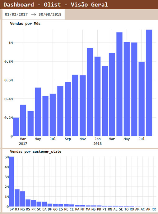
Para o gráfico de vendas por mês a função receberá as datas e a categoria de produtos, gerará um gráfico de colunas e enviará para a posição no layout.
Para o gráfico de vendas por estado a função receberá as datas e a categoria de produtos, gerará um gráfico de colunas – cada coluna sendo um estado –, e enviará para o a posição no layout (em baixa do de vendas mensais.
O código ficou assim:
# ===================================================================== #

def f_order_items_filtro_data( start_date, end_date ):

    f_order_items2 = f_order_items.loc[

        ( f_order_items['order_delivered_customer_date'] >= start_date )

        & ( f_order_items['order_delivered_customer_date'] <= end_date )

    ]

    return f_order_items2

# --------------------------------------------------------------------- #

# ===================================================================== #

# ============================ Coluna 1 =============================== #

# ===================================================================== #

@callback(

    Output(component_id="graph_vendas_state", component_property="figure"),

    Input(component_id ="date_range",         component_property="start_date"),

    Input(component_id ="date_range",         component_property="end_date"),

    Input(component_id ="category_dropdown",  component_property="value")

)

def update_graph_vendas_state( start_date, end_date, category_dropdown ):

    f_order_items2 = f_order_items_filtro_data( start_date, end_date )

    if category_dropdown == None:

        f_order_items2

    else:

        f_order_items2 = f_order_items2.loc[

            f_order_items2['product_category_name'].isin([category_dropdown])

        ]

    f_order_items2 = f_order_items2.groupby([

        'customer_state'

    ], observed=True).agg(

        total_price = ('price','sum')

    ).sort_values('total_price', ascending=False).reset_index()

    fig = go.Figure().add_trace(

        go.Bar(

            x = f_order_items2['customer_state'],

            y = f_order_items2['total_price'],

            name = "total_price",

            orientation = 'v'

        )

    ).update_layout(

        margin       = dict(l=30, r=10, b=5, t=35),

        plot_bgcolor = "white",

        bargap       = 0.1,

        font         = dict(family=body_font_family, size=body_font, color='black'),

        hoverlabel   = dict( font_family=body_font_family, font_size=body_font ),

        title        = f"<b>Vendas por customer_state</b>",

        title_font   = dict(size=body_font, color='black', family=body_font_family),

    ).update_xaxes(

        showgrid  = True,

        gridwidth = 1,

        gridcolor = 'lightgray',

    ).update_yaxes(

        showgrid  = True,

        gridwidth = 1,

        gridcolor = 'lightgray',

        range     = [ 0, f_order_items2['total_price'].max() ]

    )

    return fig

# --------------------------------------------------------------------- #

@callback(

    Output(component_id="graph_vendas_geral", component_property="figure"),

    Input(component_id ="date_range",         component_property="start_date"),

    Input(component_id ="date_range",         component_property="end_date"),

    Input(component_id ="category_dropdown",  component_property="value"),

    Input(component_id ="graph_vendas_state", component_property="hoverData"),

    Input(component_id ="graph_vendas_city",  component_property="hoverData")

)

def update_graph_vendas_geral( start_date, end_date, category_dropdown, graph_vendas_state, graph_vendas_city ):

    f_order_items2 = f_order_items_filtro_data( start_date, end_date )

    if category_dropdown == None:

        pass

    else:

        f_order_items2 = f_order_items2.loc[

            f_order_items2['product_category_name'].isin([category_dropdown])

        ]

    f_order_items2['customer_date'] = f_order_items2['order_delivered_customer_date'].dt.to_period('M').dt.to_timestamp()

    if graph_vendas_state == None:

        pass

    else:

        f_order_items2 = f_order_items2.loc[

            f_order_items2['customer_state'] == graph_vendas_state['points'][0]['x']

        ]

    if graph_vendas_city == None:

        pass

    else:

        f_order_items2 = f_order_items2.loc[

            f_order_items2['customer_city'] == graph_vendas_city['points'][0]['y']

        ]

    f_order_items2 = f_order_items2.groupby([

        'customer_date'

    ], observed=True).agg(

        total_price = ('price','sum')

    ).reset_index()

    fig = go.Figure().add_trace(

        go.Bar(

            x = f_order_items2['customer_date'],

            y = f_order_items2['total_price'],

            name             = "total_price",

            orientation      = 'v',

            xperiodalignment = "start",

        )

    ).update_layout(

        margin       = dict(l=35, r=10, b=30, t=45),

        plot_bgcolor = "white",

        bargap       = 0.1,

        font         = dict(family = body_font_family, size = body_font, color = 'black'),

        hoverlabel   = dict(font_family = body_font_family, font_size = body_font ),

        title        = f"<b>Vendas por Mês</b>",

        title_font   = dict(size = body_font +1, color = 'black', family = body_font_family),

    ).update_xaxes(

        showgrid   = True,

        gridwidth  = 1,

        gridcolor  = 'lightgray',

        dtick      = "M2",

        tickformat = "%b\n%Y",

        range      = [ pd.to_datetime(start_date) - pd.to_timedelta(14, 'D'), end_date ], #end_date

    ).update_yaxes(

        showgrid  = True,

        gridwidth = 1,

        gridcolor = 'lightgray',

        range     = [ 0, f_order_items2['total_price'].max() ]

    )

    return fig

# ===================================================================== #
2ª Coluna
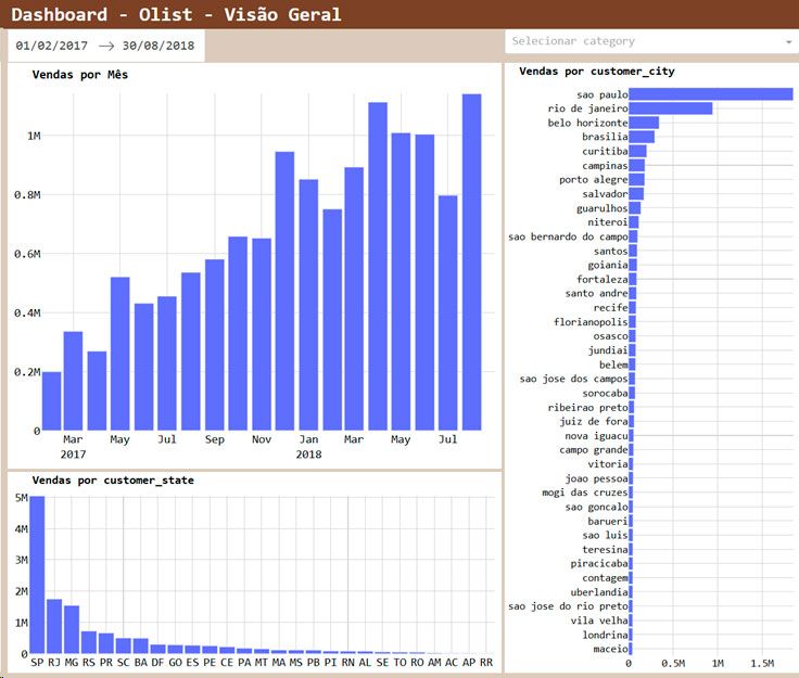
Para o gráfico de vendas por cidade a função receberá as datas e a categoria de produtos, gerará um gráfico de colunas – cada coluna sendo um estado –, e enviará para o a posição no layout.
O código ficou assim:
# ===================================================================== #

# ============================ Coluna 2 =============================== #

# ===================================================================== #

@callback(

    Output(component_id="graph_vendas_city", component_property="figure"),

    Input(component_id ="date_range",        component_property="start_date"),

    Input(component_id ="date_range",        component_property="end_date"),

    Input(component_id ="category_dropdown", component_property="value"),

    Input(component_id ="graph_vendas_state", component_property="hoverData")

)

def update_graph_vendas_city( start_date, end_date, category_dropdown, hoverData ):

    f_order_items2 = f_order_items_filtro_data( start_date, end_date )

    if category_dropdown == None:

        f_order_items2

    else:

        f_order_items2 = f_order_items2.loc[

            f_order_items2['product_category_name'].isin([category_dropdown])

        ]

    if hoverData == None:

        f_order_items2 = f_order_items2.groupby([

            'customer_city'

        ], observed=True).agg(

            total_price = ('price','sum')

        ).sort_values('total_price', ascending=True).reset_index()

    else:

        f_order_items2 = f_order_items2.loc[

            f_order_items2['customer_state'] == hoverData['points'][0]['x']

        ].groupby([

            'customer_city'

        ], observed=True).agg(

            total_price = ('price','sum')

        ).sort_values('total_price', ascending=True).reset_index()

    f_order_items2 = f_order_items2.tail(40)

    fig = go.Figure().add_trace(

        go.Bar(

            x = f_order_items2['total_price'],

            y = f_order_items2['customer_city'],

            name        = "total_price",

            orientation = 'h'

        )

    ).update_layout(

        margin       = dict(l=25, r=10, b=5, t=35),

        plot_bgcolor = "white",

        bargap       = 0.1,

        font         = dict(family = body_font_family, size = body_font -2, color='black'),

        hoverlabel   = dict(font_family = body_font_family, font_size = body_font ),

        title        = f"<b>Vendas por customer_city</b>",

        title_font   = dict(size = body_font, color = 'black', family = body_font_family),

    ).update_xaxes(

        showgrid  = True,

        gridwidth = 1,

        gridcolor = 'lightgray',

        range     = [ 0, f_order_items2['total_price'].max() ]

    ).update_yaxes(

        showgrid  = True,

        gridwidth = 1,

        gridcolor = 'lightgray',

    )

    return fig

# ===================================================================== #
3ª Coluna
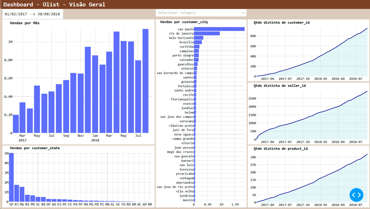
Serão 3 gráficos semelhantes. No eixo ‘x’ teremos a data e no ‘y’ teremos, para o primeiro, a quantidade distinta acumulada de clientes, para o segundo, a quantidade distinta acumulada de vendedores, e para o terceiro, a quantidade distinta acumulada de produtos.
O propósito da 3ª coluna do nosso dashboard é observar se a plataforma está crescendo, ou seja, se está gerando engajamento da comunidade.
O código ficou assim:
# ===================================================================== #

def grafico_contagem_acumulada( start_date, end_date, variavel ):

    f_order_items2 = f_order_items_filtro_data( start_date, end_date )

    f_order_items2 = f_order_items2.sort_values('order_delivered_customer_date')

    f_order_items2 = f_order_items2[[ 'order_delivered_customer_date', variavel ]].drop_duplicates( variavel )

    f_order_items2[ variavel ] = 1

    f_order_items2['cumcount'] = f_order_items2[ variavel ].cumsum()

    f_order_items2 = pd.concat([

        f_order_items2,

        pd.DataFrame( [{

            'order_delivered_customer_date':end_date,

            variavel:variavel,

            'cumcount':f_order_items2['cumcount'].max()

        }] )

    ], ignore_index=True )

    f_order_items2.reset_index(drop=True)

    fig = go.Figure().add_trace(

        go.Scatter(

            x = f_order_items2['order_delivered_customer_date'],

            y = f_order_items2['cumcount'],

            fill         = 'tonexty',

            marker_color = "darkblue",

            fillcolor    = "rgba(164,219,232, 0.25)",

            line         = dict(width=2.5),

            name         = variavel

        )

    ).update_layout(

        margin       = dict(l=40, r=10, b=3, t=40),

        plot_bgcolor = "white",

        bargap       = 0,

        font         = dict(family=body_font_family, size=body_font -1, color='black'),

        hoverlabel   = dict( font_family=body_font_family, font_size=body_font ),

        title        = f"<b>Qtde distinta de {variavel}</b>",

        title_font   = dict(size=body_font, color='black', family=body_font_family),

    ).update_xaxes(

        showgrid   = True,

        gridwidth  = 1,

        gridcolor  = 'lightgray',

        tickformat = "%Y-%m",

        range      = [ start_date, end_date ]

    ).update_yaxes(

        showgrid  = True,

        gridwidth = 1,

        gridcolor = 'lightgray',

        range     = [ 0, f_order_items2['cumcount'].max() ]

    )

    return fig

# ===================================================================== #

# ===================================================================== #

# ============================ Coluna 3 =============================== #

# ===================================================================== #

@callback(

    Output(component_id="graph_qtd_customer", component_property="figure"),

    Input(component_id ="date_range",         component_property="start_date"),

    Input(component_id ="date_range",         component_property="end_date")

)

def update_graph_qtd_customer( start_date, end_date ):

    fig = grafico_contagem_acumulada(start_date=start_date, end_date=end_date, variavel='customer_id')

    return fig

# --------------------------------------------------------------------- #

@callback(

    Output(component_id="graph_qtd_seller", component_property="figure"),

    Input(component_id ="date_range",       component_property="start_date"),

    Input(component_id ="date_range",       component_property="end_date")

)

def update_graph_qtd_seller( start_date, end_date ):

    fig = grafico_contagem_acumulada(start_date=start_date, end_date=end_date, variavel='seller_id')

    return fig

# --------------------------------------------------------------------- #

@callback(

    Output(component_id="graph_qtd_category", component_property="figure"),

    Input(component_id ="date_range",         component_property="start_date"),

    Input(component_id ="date_range",         component_property="end_date")

)

def update_graph_qtd_category( start_date, end_date ):

    fig = grafico_contagem_acumulada(start_date=start_date, end_date=end_date, variavel='product_id')

    return fig

# ===================================================================== #
Para dar um efeito parecido com o do Power BI utilizamos o texto que aparece quando colocamos o mouse em cima das colunas dos gráficos de vendas por estado e por cidade para servir de filtro.
Considerações
Está é uma pequena amostra do que é possível fazer com os dashboards da biblioteca Dash e a linguagem Python. Seria possível incluir cadastramento de itens, de usuários, gerar um executável para outras pessoas acessarem, e muito mais.
Muito obrigado por ler o artigo.
Até o próximo!